Build fast, your way
Makeswift is the visual builder that plays nice with your codebase. Keep full control of components, performance, and integrations, while giving marketers the freedom to move without breaking things.
ISR support
Keep pages up to date with on-demand revalidation—zero config needed and always included for free.
Code splitting
Dynamically register components for smaller bundles and faster loads.
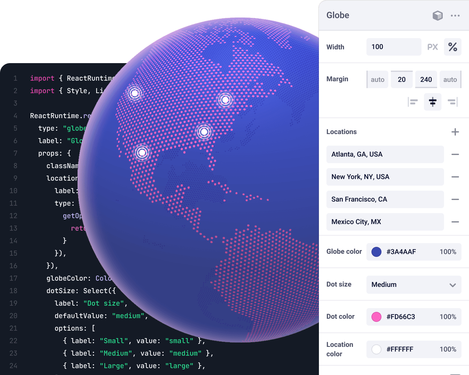
Composable controls
Map visual UI controls to any JSON-based prop structure.
Intuitive APIs
Query Makeswift like any headless CMS using simple, predictable APIs.
Decoupled components
Makeswift sits outside of your components so you can use them in code or visually without any rewrites.
Seamless integration
Use our CLI to scaffold a new project and get up and running with Makeswift in just a few commands.
Minimal runtime overhead
Progressive hydration and static generation keep your site fast—without bloated scripts or runtime tradeoffs.
Incremental adoption
Add Makeswift to existing pages gradually—enable full-page editing or just specific regions without rewriting your entire application.
Powered by the future
Makeswift leverages frameworks like React, Next.js, and TypeScript for fast, flexible frontends without the weight of outdated tools.


Your components, your way
Bring your existing React components into Makeswift without changes. Marketers get visual access, developers stay in control.


Type-safe from the start
Avoid component integration errors with helpful error messages and autocomplete in your favorite IDE.


Resources
We have a robust collection of resources and guides to help along the way.