In the past cycle at Makeswift, we upgraded our component tray so that finding and organizing your components is easier than ever.
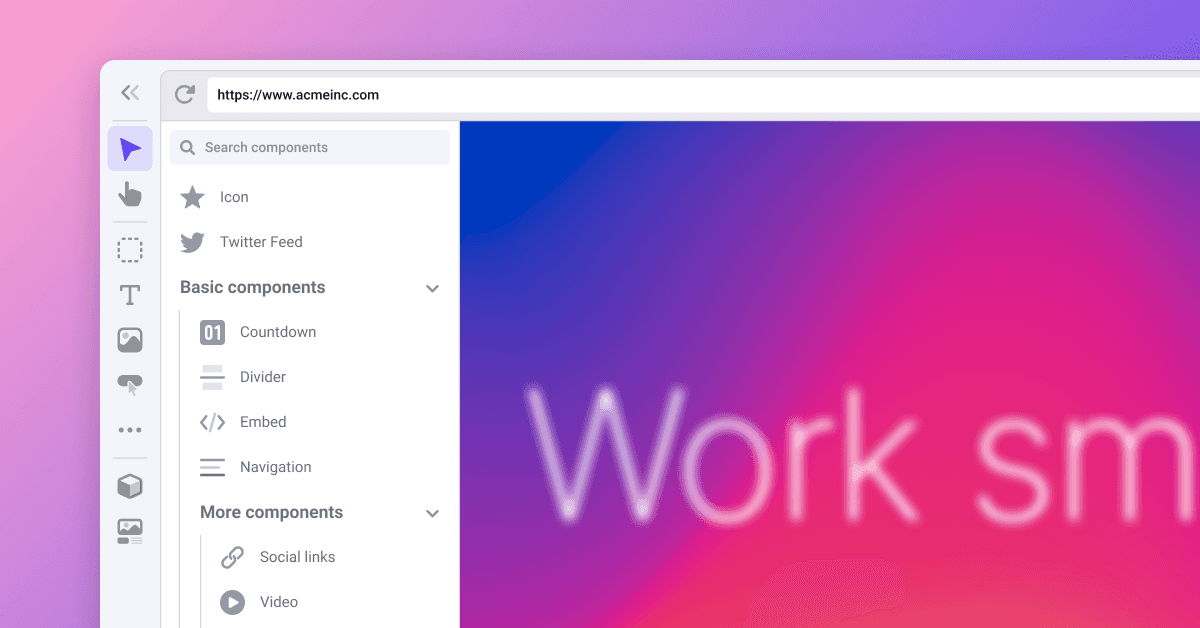
We rearranged the component tray to use rows so that you can quickly scan through it, and we added customizable icons (See #3 above) so that components are easier to recognize.
We also added a way to organize and search the component tray. When you use forward slashes in your component names, the tray will now render them into collapsible sections automatically (#2). And with the new search bar (#1), you can search through your components by folder and name.
All in all, we wanted to make sure that finding components happened at the speed of thought. For more detailed examples and a full list of icon options go to the updated component registration docs.
Under construction 🚧
Over the past few weeks, we have been working on some new controls, one of which is unstable_StyleV2 . The current version of the Style control has a limited number of CSS-specific controls that you can customize with the properties option. This API works great for things like controlling Width and Padding, but it breaks down if you want to control something responsively that isn’t CSS.
Let’s say you have a Button component with predefined variants for controlling size (small, medium, and large). Currently, there is no way to specify a variant for each breakpoint. If you set the variant to small on mobile it will also be small on desktop. With the new Style API, you can responsively control a variant.
function Button({ className }) {
  return <button className={className}>Text</button>
}

ReactRuntime.registerComponent(Button, {
  type: 'button',
  label: 'Button',
  props: {
    className: Style({
	  type: Select({
	    label: 'Variant',
	    options: [
	      { label: 'Small', value: 'small' },
	      { label: 'Medium', value: 'medium' },
	      { label: 'Large', value: 'large' },
	    ],
	    defaultValue: 'medium',
	  }),
	  getStyle(variant) {
	    switch (variant) {
	      case 'small':
	        return { fontSize: '14px' }
	      case 'large':
	        return { fontSize: '18px' }
	      default:
	        return { fontSize: '16px' }
	    }
	  },
	}),
  },
})
With this new Style API, you will be able to make controls breakpoint specific. In our button example above, we use a Select control for selecting a variant on each breakpoint. Then Style automatically generates a class name with media queries using `getStyle` to map our control data to CSS.
There are lots more control upgrades in the works, and we are looking forward to sharing those with you in future changelogs!
Improvements & fixes
Fixed a bug where deleting a published page didn’t take it offline
Fixed a bug in the Border Radius control where it was collapsing even when there were different values set for each corner
Updated the default value in the Width panel to be 100%
Upgraded the global element header to more gracefully handle long names