Starter Kits
Starter Kits are curated combinations of custom coded components within fully designed templates. Starter Kits let you experience custom components without having to touch any code.
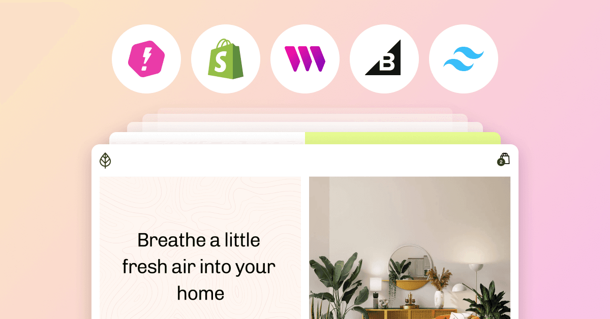
You can now browse our Starter Kits and select one during the integration process after running npx makeswift@latest in your terminal. There are currently three Starter Kits — all ecommerce examples using BigCommerce, Shopify, and an NFT drop created with thirdweb.
We are planning to create more Starter Kits in the future so hit us up in Discord to suggest which ones to create next.
Preview Mode
Preview mode is a new feature that reinforces a core design principle of Makeswift: what you see in the builder is exactly what you see when visiting your site. Without preview mode there was a discrepancy between live and preview pages which caused 2 issues:
1. Developers had to define two separate files when integrating with Makeswift
2. When previewing your site in Makeswift it wasn’t possible to navigate to pages since the URL for preview didn’t match the URL for live pages
Now, instead of requiring two pages for integrating with Makeswift, we only require 1 page and use Next.js’ Preview Mode to fetch the appropriate data when in the builder and preview `iframe`s. This removes the discrepancy we had before while also providing a better integration experience for developers.
For more background on Preview Mode, here’s a link to the RFC.
Support for on-demand revalidation
As part of this release we also introduced a new concept to the Makeswift integration: the Makeswift API route. This was necessary to support Preview Mode but also gives us the ability to support other features automatically. With it, we’ve added support for automatic on-demand revalidation. This is a big improvement since it means that Makeswift pages can be statically generated at build time and regenerated on demand whenever published, without needing to redeploy the Next.js app.
In the past we had to specify a low revalidation period of 1 second so pages would become stale after 1 second and regenerate. Now, pages only regenerate exactly when they’ve changed. If they haven’t changed, pages will stay cached forever. This results in lower infrastructure costs for Makeswift customers since most requests will be cached instead of resulting in a lambda execution for revalidation at worst every 1 second.
New Integration API
Finally, we also introduced a new client for Makeswift’s API to make the Makeswift integration more explicit and less magical. While more verbose, this should help developers better understand how Makeswift works with their Next.js app and how they can use it together with other data sources like a headless CMS, APIs, etc.
For details on how to migrate to the new release and what changed in the integration, here are the release notes.
Improvements & Fixes
- The UI for the builder header has been redesigned to resemble a browser bar. When integrating with Makeswift, this change better communicates that what you see in the builder is your own app.
- Sites hosted by Makeswift have been updated to React 18. This update also fixes typing latency issues some users were experience using our text component.
- New and duplicated pages have prettier URLs by default
- Fixed a bug where certain punctuation in table column names prevented those fields from being recorded in forms
- The workspace and site selectors in the CLI process are now being sorted alphabetically
- Fixed an issue causing the hover preview thumbnails shown in the pages sidebar to not display the correct page
- When logging back into your account, you’ll now immediately be redirected to your last visited page in the builder
- Added the ability to easily add environment variables depending on the selected Starter Kit
- Added a flag to the CLI to auto select a Starter Kit
- Updated our Vercel integration to preselect templates based on the deploy link
- Fixed an issue causing the builder canvas to show up as transparent instead of white