Quickstart
We recommend using the automatic setup to explore Makeswift in a fresh Next.js app. If you have an existing Next.js app, you can use the manual installation guide.
Requirements
You will need the following:
- Node.js 18.17 or a later version.
- macOS, Windows (including WSL), and Linux are supported.
- Familiarity with Next.js.
You don’t need an existing Makeswift account to get started with this guide.
Automatic setup
Initialize the app
Perform the following CLI command.
npx makeswift@latest init
After you confirm you’d like to integrate your app, the CLI generates all the necessary files in the project folder.
The CLI then opens a new page in your browser where you will continue integrating your app.
Connect the Next.js app to a Makeswift site
The browser will prompt you to select a Makeswift site to connect to your local Next.js app. You may need to login or sign up, but the browser will redirect you to this page.


Make sure to check your console during the linking process. If the CLI fails to install dependencies you may need to install them manually.
Start building
The browser redirects you to the Makeswift Builder once the integration is complete. If you skipped the template option, make sure to create a page.

You should find some new custom components in the toolbar.
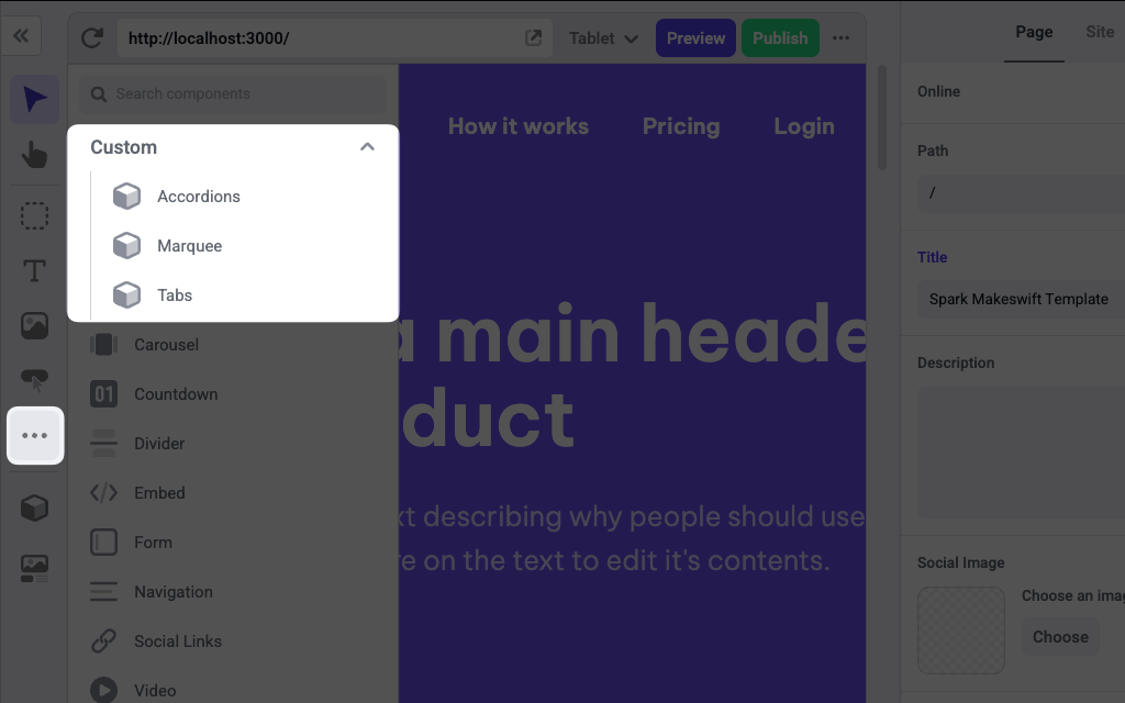
These components will be located in the components folder of your Next.js app. You can explore the files ending with .makeswift.ts to learn more about registering components.
To learn how to use Makeswift builder, see the Help Center articles.
Was this page helpful?